An Introduction to CSS Logical Properties
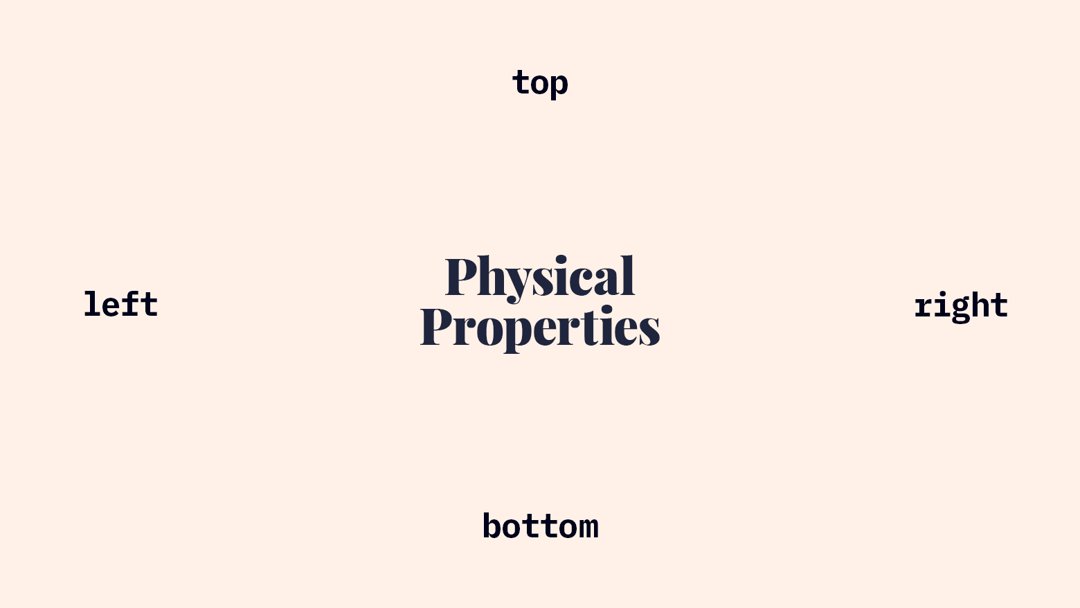
For years, we’ve identified CSS locations with physical keywords: top, right, bottom, and left. These words are tied to the physical dimensions of the browser viewport itself. Any property containing the word left is connected to the left edge of the browser window. Many properties use this physical location syntax (margin, padding, border, and the position-related properties).
We’ve been writing CSS like this for so many years, it’s hard to imagine changing the way we think about identifying locations. However, there’s a new evolution in the way we identify locations and directions in CSS, and it allows us to create much more robust layouts with less code! Let’s take a look at logical properties.
What Logical Properties Describe
Logical properties respond automatically to text direction and writing mode. This means that locations formerly identified by left and right will automatically reverse for RTL layouts, and horizontal and vertical properties will automatically rotate for vertical writing mode.
If you’re not familiar with “LTR” (left-to-right) and “RTL” (right-to-left) or vertical writing mode, I recommend reading Jen Simmons’ post on writing modes or watching her writing modes video.
Block & Inline
The new keywords block and inline describe vertical and horizontal axes. To remember how these properties work, I like to picture a long paragraph of text.
The block axis runs from the start to the end of the block of text. For languages with horizontal text direction (including both LTR and RTL), that’s the axis that runs from the top to the bottom of the paragraph. For languages with vertical writing mode, the block axis still runs from the start to the end of each block of text. Because these languages present text in vertical columns, however, the block axis automatically adapts and runs horizontally.
The inline axis runs from the start to the end of a line of text in the paragraph. For LTR and RTL languages, that’s horizontal. Just like before, when you use inline properties in a vertical writing mode, the inline axis adapts and runs vertically.
Another way to describe these new axes is:
block= perpendicular to a line of textinline= parallel to a line of text
Start & End
Now that we can use block and inline to identify vertical and horizontal dimensions in a way that adapts to writing mode, we can add start and end to identify which end of the axis we need to target.
Comparison to Physical Properties
Let’s get our bearings by looking at the old familiar physical properties

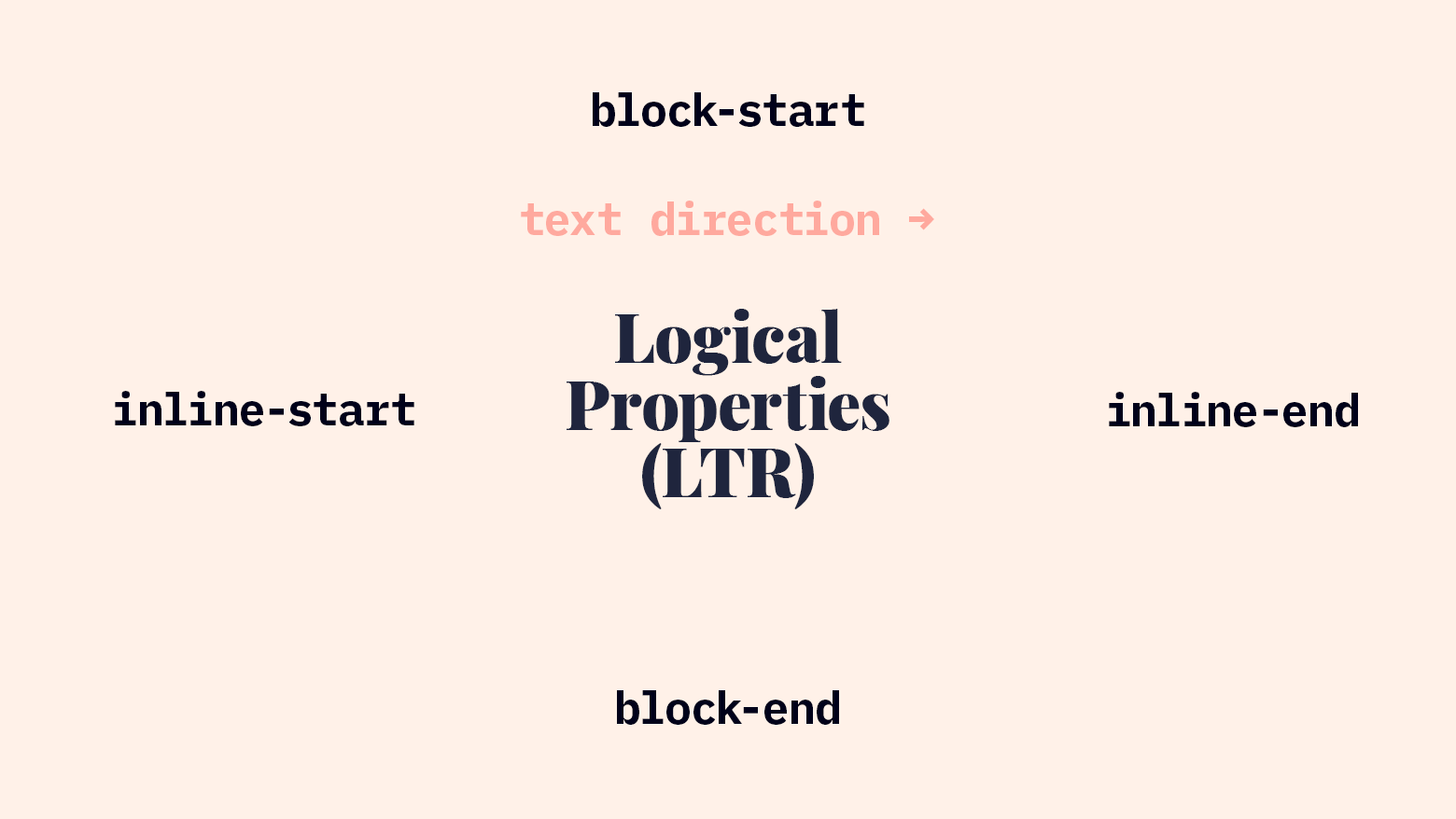
Now, how do logical properties compare to current physical properties in LTR writing mode?
block-startmatchestopinline-startmatchesleftblock-endmatchesbottominline-endmatchesright

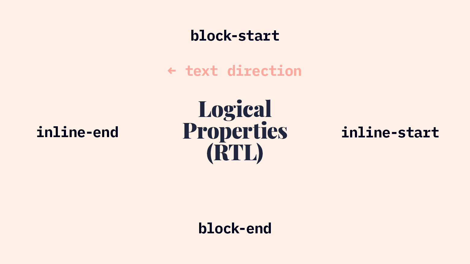
Now, watch how these properties respond to a change in localization. If our site is translated into Arabic or Hebrew, the dir="rtl" attribute will cause this change in the inline locations:
block-startmatchestopinline-startmatchesrightblock-endmatchesbottominline-endmatchesleft

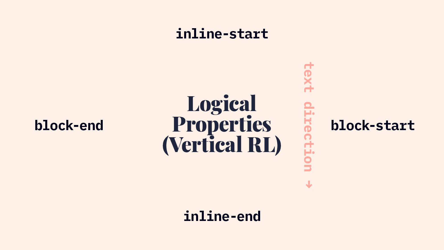
RTL is cool, but let’s check out the vertical text. Han-based languages (sometimes identified as CJK: Chinese, Japanese, Korean) can run vertically from right to left. If we were building a web app that would be localized for users reading these languages, we could support that writing mode by adding writing-mode: vertical-rl to the root element. Then our logical properties would adapt to match the rotated block and inline axes:
block-startmatchesrightinline-startmatchestopblock-endmatchesleftinline-endmatchesbottom

All the physical properties I mentioned above can be replaced with logical properties: margin, padding, and border properties can be replaced with logical suffixes. Positioning properties like top are replaced by inset-block-start. You can even use float and clear with logical values: inline-start and inline-end.
Using Logical Properties
Let’s take a look at some examples of logical properties in real life!
Available Properties & Values
Here are a few lists of logical properties and values:
Properties & Values that You Might Not Have Realized Are Logical
In Flexbox and Grid, justify-* and align-* use logical values.
startendflex-startflex-end
Logical Properties with Solid Modern Browser Support
margin-block-startand similarpadding-inline-endand similarborder-block-endand similartext-alignwithstart/endvalues
Logical Properties & Values with only Firefox Support
inset-block-startand similarfloatwith logical valuesclearwith logical values
Breaking these properties down helps us decide which to use.
- Seeing Flexbox and Grid as logical property systems help us get our minds around the concepts.
- The properties that are widely supported are worth exploring now (if you don’t support IE11).
- The properties and values that are Firefox-only are good to know about, but not ready for production use, in my opinion.
Text Alignment in a Grid
To begin, here’s an example of logical properties at work in some code that may feel familiar to many front-end devs.
<div class="job">
  <h2 class="job__title">Office Manager</h2>
  <p class="job__location">Remote / Chicago</p>
  <p class="job__department">Employee Experience</p>
  <p class="job__hours">Full-Time</p>
</div>
.job {
  display: grid;
  grid-template-columns: 1fr auto;
  column-gap: 1rem;
  align-items: center;
  justify-content: start;
}

.job__location,
.job__hours {
  justify-self: end;
}
We’ve created a simple job posting card layout with CSS Grid. The column containing the title and department will take up as much room as is available, and the column with the location and hours will be only as wide as it needs to be. We’ll need to align both the location and hours to the end of their column.
Let’s find the logical properties here. First, in justify-content - the grid columns will all be shifted to the start of the inline axis. In LTR, they’ll be at the left; in RTL, they’ll be at the right. Second, we’re overriding that start value for the location and hours. We always want that text to be aligned to the end of the grid, so we justify it with end. In the past, you might’ve just put text-align: right on that element (and then needed more CSS to override that in RTL mode). However, using Grid with justify-self: end, we get the same visual effect and it automatically switches for non-LTR writing modes.
And yes, text-align: end would produce the same effect as justify-self: end in this context.
Absolutely-Positioned Buttons
I recently worked on a project with horizontally-scrollable rows. Each row had scroll-left / scroll-right buttons absolutely positioned at the left and right edges. The row used Grid layout, so as soon as we went RTL, it flipped automatically, but the buttons stayed put. Let’s use logical properties to solve that problem.
<div class="scroll-row">
  <div class="scroll-row__contents">
    <!-- lots of items -->
  </div>
  <button class="scroll-row__button scroll-row__button--back">Back</button>
  <button class="scroll-row__button scroll-row__button--forward">Forward</button>
</div>
.scroll-row {
  position: relative;
}

.scroll-row__button {
  width: 50px;
  position: absolute;
  top: 0;
  bottom: 0;
}

.scroll-row__button--back {
  /* left: -50px; */
  inset-inline-start: -50px;
}

.scroll-row__button--forward {
  /* right: -50px; */
  inset-inline-end: -50px;
}
Using left and right would have caused RTL problems, but using inset-inline-* creates positioning that responds correctly to changes in writing mode.
Floated Images
You can use logical properties to make sure floated images are positioned correctly as well. With the existing physical properties, it was common to float images like this:
img.left {
  margin-right: 1rem;
  margin-bottom: 1rem;
  float: left;
  clear: left;
}

img.right {
  margin-left: 1rem;
  margin-bottom: 1rem;
  float: right;
  clear: right;
}
But now, with logical properties, we can make that more resilient:
img.start {
  margin-inline-end: 1rem;
  margin-block-end: 1rem;
  float: inline-start;
  clear: inline-start;
}

img.end {
  margin-inline-start: 1rem;
  margin-bottom: 1rem;
  float: inline-end;
  clear: inline-end;
}
Conclusion
Browser Support
Logical properties appear to have remarkably good browser support. According to caniuse, logical property support is as good as Grid support: all major desktop browsers, Mobile Safari, and modern Android browsers.
However, that’s not the end of the story. I wish it were. It’d be great if logical properties worked as well as caniuse indicates!
First, a number of the properties I showed above are only supported by Firefox at the time of writing:
inset-block-startinset-block-endinset-inline-startinset-inline-endclear: inline-*float: inline-*
This means “non-supporting browsers” is a pretty large category. You still support some browsers that are at least partially non-supporting, even if you’ve dropped IE11. In this case, you could start writing logical properties now and use a PostCSS plugin called postcss-logical-properties to back-fill the old physical values. However, it’s worth noting that that plugin only supports LTR/RTL, not any vertical writing modes.
Without using that PostCSS plugin (which I haven’t tried out on any significant projects, so your mileage may vary), fallback CSS is a bit tricky. The fallback CSS requires an additional attribute selector ([dir="rtl"]) and that raises your specificity. That higher specificity now overrides your logical property code, even in modern browsers. In the code example below, the 2nd block overrides the 3rd even in supporting browsers, making the logical property effectively worthless. (@supports and @media queries don’t increase specificity.)
.element {
  margin-right: 2rem;
}
[dir="rtl"] .element {
  margin-right: 0;
  margin-left: 2rem;
}
@supports (margin-inline-end: 0) {
  .element {
    margin-inline-end: 2rem;
  }
}
If all your supported browsers support @supports, you could do use both positive and negative @supports queries. Note: IE11 doesn’t support @supports so this won’t work there.
@supports not (margin-inline-end: 0) {
  .element {
    margin-right: 2rem;
  }
  [dir="rtl"] .element {
    margin-right: 0;
    margin-left: 2rem;
  }
}
@supports (margin-inline-end: 0) {
  .element {
    margin-inline-end: 2rem;
  }
}
However, that’s a lot of code. In fact, you could delete almost half (6 of those 13 lines) and nothing would change.
Unlike CSS Grid and some other areas where new CSS allows entirely new behavior, there’s no visible difference for users if you use logical properties with fallbacks. There are extra lines of code, I’m afraid.
As a rule, I don’t subscribe to the idea that “we shouldn’t use new CSS if we still need to write fallback styles.” However, in this case, writing logical properties with physical property fallbacks has significant specificity complications (which aren’t an issue with Grid). Additionally, the presence of merely partial support in Chrome and Safari makes fallbacks entirely necessary. Here’s a very detailed explanation of current shortcomings with logical properties.
My Recommendations
At this point, my recommendation for implementing logical properties is cautious:
- Only use properties and values that work in all your supported browsers.
- If you need to include fallback CSS in the same stylesheet, just use the fallback. Save logical properties for later.
- If you need to support older browsers but you’re itching to use logical properties, use logical properties with a PostCSS plugin that converts them to physical properties.
- If your project uses code-splitting in a way that allows different CSS delivery methods that match browser support for logical properties, use logical properties in the CSS that’s delivered to supporting browsers and use physical properties in the CSS that’s sent to non-supporting browsers.
Even if your current projects and requirements don’t allow you to use logical properties in all the ways mentioned here, don’t lose heart! Support will continue to grow and browser support baselines will improve. Knowing this syntax will set up well to write better CSS in the near future.